The history of the logos of Detroit's professional sports teams
There have been countless iconic images that represent Detroit sports over the last century.
There’s Magglio Ordóñez rounding the bases after a walk-off home run to send the Detroit Tigers to the World Series, Steve Yzerman raising the Stanley Cup to end the Detroit Red Wings' 42-year drought, Isiah Thomas and the Bad Boys celebrating the Detroit Pistons' first NBA championship and Detroit Lions legend Barry Sanders surpassing 2000 yards in a single season, just to name a few.
All of these athletes accomplished those feats wearing Detroit logos, some of which have been long retired and some that still live on.
Much like Taylor Swift revisiting her eras on tour, here’s a look back at the eras of Detroit sports logos you might not remember “all too well”:
Detroit Red Wings
The Red Wings have stuck with tradition for the most part, as the franchise hasn’t drastically altered its logo since the 1948-49 season.
Before the Red Wings came to be however, the team went by a few other names. Professional hockey came to Detroit in 1926 with the acquisition of the Victoria Cougars, with the new team holding onto Victoria’s mascot.
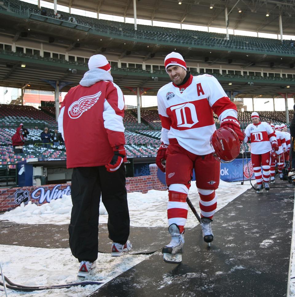
The Detroit Cougars kept their logo simple with a red Old English D. In 1927, the franchise updated it slightly by making the D white and surrounded it with a red badge shaped banner with a white outline.
General manager Jack Adams changed the name to the Detroit Falcons during the 1930-31 season. The Falcons’ logo consisted of the words “Detroit Falcons” written in yellow letters with a red outline.
HELENE ST. JAMES: Filip Zadina latest example how hard it is to get it right in NHL draft
Jack Norris Sr. got involved with the organization and he and Adams renamed the team in 1932, beginning the Detroit Red Wings tradition. With that, a new logo was needed.
The original logo isn’t too far off from the one the franchise uses today. The wheel came from Detroit’s success in the automotive industry (hence the Motor City nickname) and the wing incorporates the team’s name into the design.
The logo got an update during the 1948-49 season to the logo, and it hasn't really changed much since. The wheel is smaller, and the bottom half of the outer rim is red while the upper half is white. The wing is also larger than the previous logo.
This is the logo worn by Red Wings of many eras, including Yzerman, Gordie Howe, Sergei Fedorov, Nicklas Lidstrom, Henrik Zetterberg, Pavel Datsyuk and current captain Dylan Larkin.
Detroit Tigers
Unlike the Red Wings, the Tigers have had many logos — 23 to be exact.
According to Chris Creamer of sportslogos.net, the team’s first logo was a red silhouette of a tiger. That design was used during the 1901-02 season. In 1903, the Tigers shifted to a black block D before moving onto a black Old English D in 1904. The organization then used multiple variations of a navy D until 1927.
They decided to make a big change in 1927 by switching the logo to a bright orange two-dimensional roaring tiger head with white eyes. That design was quickly retired however, and the navy Old English D was brought back, but this time with a thin orange border. Much like the tiger head, the orange border was quickly dropped just the navy blue Old English D remained for the 1930 season.
The team went back to a navy block D from 1931-33, but switched back to the 1930 Old English D in 1934. That logo would remain representative of the team until 1956. In that time, the Tigers won two World Series — in 1935 and 1945. Players from this era include Hank Greenberg, Charlie Gehringer, Hal Newhouser, Dizzy Trout and Tommy Bridges.
The team rebranded yet again in 1957, bringing back a roaring tiger head design. Unlike the 1927 logo, this one was more ferocious. It had menacing fangs and bulging eyes as well as more prominent stripes and whiskers. In 1961, it was updated to include a thick black circle with the words “Detroit Tigers” written in white within it. It was updated once again in 1964 where the circle was changed to the color blue and the tiger head had a blue tint to it.
This design lasted until 1993. In this era, the Tigers won two more World Series — 1968 and 1984. Al Kaline, Alan Trammell, Lou Whitaker, Norm Cash, Mickey Lolich, Jack Morris, Kirk Gibson, Chet Lemon and Lance Parrish are just some of the big names that donned the Old English D in this time period.
CARLOS MONARREZ: Eduardo Rodriguez's return to Tigers feels like a train to nowhere
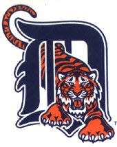
After nearly 40 years, the organization decided to switch it up again. From 1994-2005, the official logo was a roaring tiger crawling through a hole in the Old English D with its tail curling around the top left point.
In 2006, the team decided to return to the classic 1930 Old English D. That same year the Tigers would go to the World Series but lost to the St. Louis Cardinals. The logo would last until 2015. Players from this era include Miguel Cabrera, Justin Verlander, Max Scherzer, Curtis Granderson and Ivan Rodriguez.
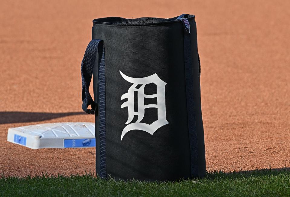
The current logo, which debuted in 2016, is very similar to the classic navy Old English D, just with much thinner lines. The Tigers have yet to achieve a successful season under the current logo, last winning the AL Central Division in 2014.
Detroit Lions
Throughout history the Lions have kept a key component of their logo. All six logos have featured a lion charging into battle.
The first logo, which debuted in 1952, depicts a football player dressed in an old-fashioned uniform and helmet, reflective of the times, riding a gold roaring lion. This logo was in place until 1960, but before then, the Lions won three of their four NFL championships. Quarterback Bobby Layne was their star, having led the team to all three championships.
The design was updated in 1961 to depict a thin white lion with a light blue outline in the middle of two vertical bars; the one on the right being silver and the left being blue. This logo remained in place until 1969. It was in this era, 1963 to be exact, when William Clay Ford took over majority ownership of the team.
A NEW LOOK: Lions unveil new alternate helmets for 2023 season
The logo became more modern in 1970. It was updated to a blue silhouette of a lion pouncing with a thin white outline. This era of Lions football lasted until 2002 and included Hall of Fame running back Barry Sanders, who played from 1989-1999. In 1997, Sanders became just the third running back in NFL history to rush for over 2,000 yards in one season.
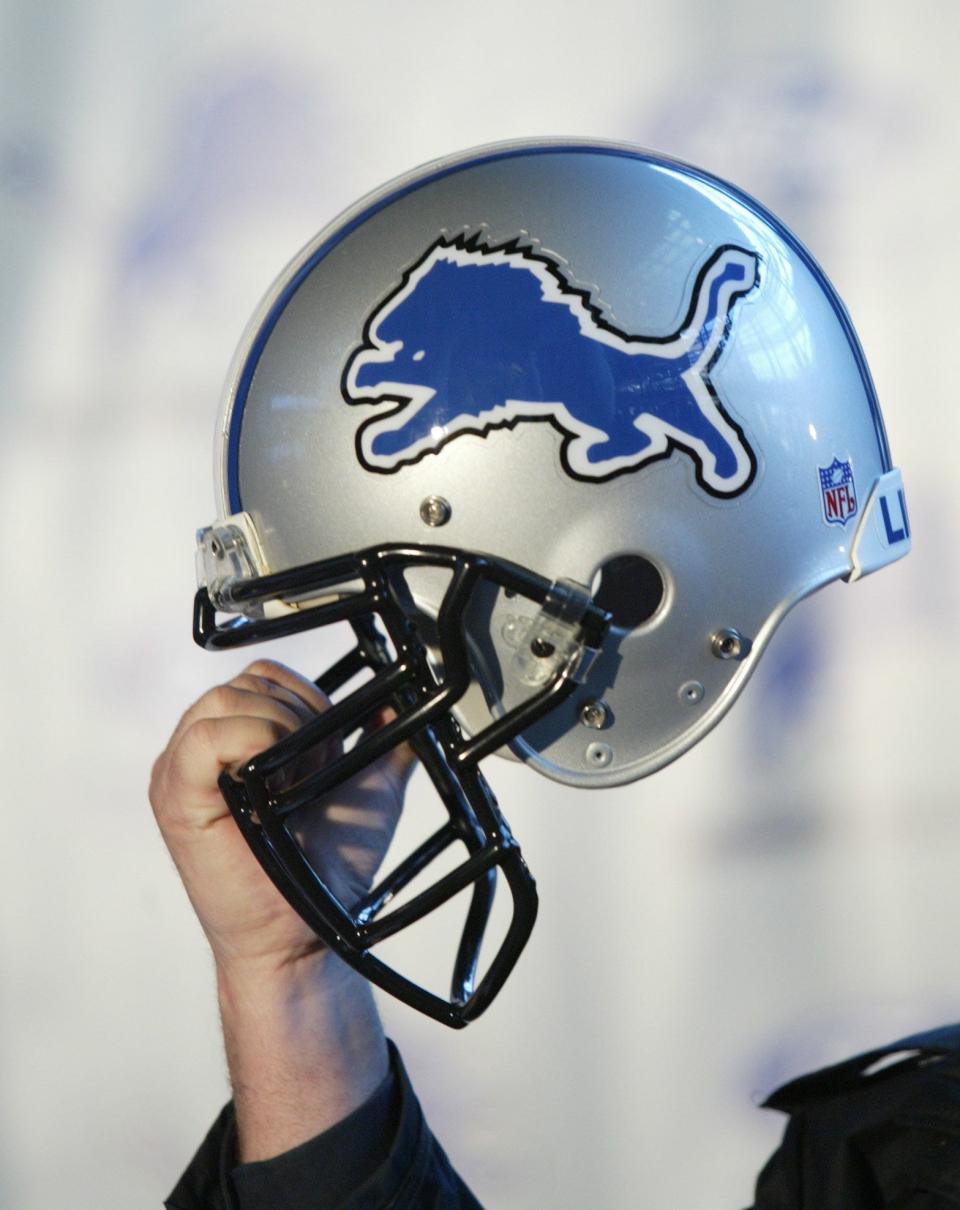
The lion was updated slightly in 2003 with a black outline around the white one, but the logo and the team got its biggest upgrade in 2009. Quarterback Matthew Stafford was selected first overall in the 2009 NFL draft by Detroit. As the team became more defined, so did the logo. The pouncing lion was updated to depict its features, including its mane, fangs and muscles.
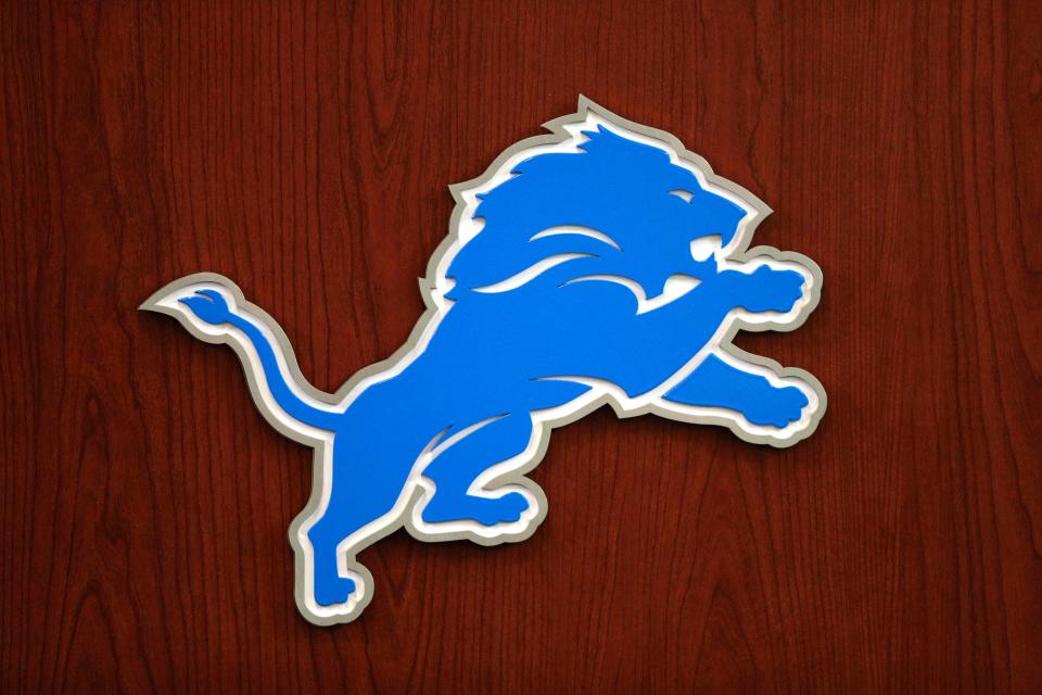
In 2017, the design was slightly modified and a silver outline was swapped with the black one. This logo remains, representing the Dan Campbell era today.
Detroit Pistons
The Pistons started out simple: a blue outline of a basketball with bold red letters that say “Detroit Pistons” within it. Below that is a box that reads “basketball club.” The design changed slightly in the 1975-76 season by making the letters white with a thin red outline and replacing the box with “NBA” in red big letters.
The logo was rejuvenated during the 1978-79 season. Although it still resembles the outline of a basketball, the outer rim is blue and the inner circle is red with white markings creating a circle for “Detroit Pistons” to be written in. This logo lasted until the 1995-96 season. It was within that time period that “the Bad Boys” era came and went.
FROM 2022`: Pistons unveil popular throwback teal uniforms for 2022-23 season
Led by NBA legends such as Isaiah Thomas, Bill Laimbeer, Dennis Rodman, Joe Dumars and Rick Mahorn, the Bad Boys helped define what some consider the golden age of the NBA. The group won the first NBA championship in franchise history in 1989 and followed it up with another one in 1990.
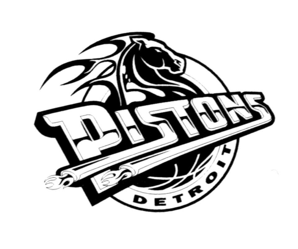
The 1996-97 season brought with it a completely new design to the logo. The word “Pistons” is written diagonally across the basketball with two exhaust pipes extending from each letter “s” in the word, a nod to the team’s name and Detroit’s success within the automotive industry. A horse’s head extends over the letters to represent “horsepower.” The original design was teal and dark red, but was updated in the 2001-02 season to blue and red.
The Pistons earned their third NBA championship in 2004 and were led by Ben Wallace, Chauncey Billups, Richard “Rip” Hamilton and Tayshaun Prince. The logo was updated once again in the 2005-06 season, this time taking a step closer to the logo of the “Bad Boys” era. The outline of the basketball was more realistic and the word “Pistons” extended over the sides of the basketball and was much bolder.
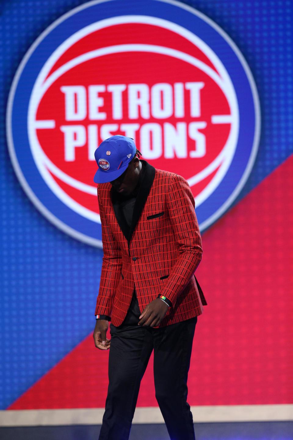
The current logo, updated in the 2017-18 season, is a completely modern version of the “Bad Boys” era logo. It’s nearly the same but has bolder and crisper lines and letters.
This article originally appeared on Detroit Free Press: History of Detroit's pro sports teams logos: Old English D and beyond
