
Color Wheel: How to Use the Simple Tool for Interior Design
Illustration: Ellie Schiltz/Getty Images
Color theory is having a moment. Whether it’s an increased interest in the work of pioneering color theorists and artists like Josef Albers or the resurgence of getting your own color analysis done, color is one of the most exciting, emotion-eliciting aspects of design and decorating. But since color theory is both an art and a science, selecting the right color palette and combinations can be particularly intimidating. Enter the color wheel, a tool that illustrates color hues and is often used for selecting paint colors and determining which hues go together.
The Color Wheel’s Backstory
The color wheel was first developed by English mathematician and physicist Sir Isaac Newton, who discovered that white light (what we perceive as colorless daylight) is composed of a spectrum of colors, from red to orange, yellow, green, blue, indigo, and violet (remember ROYGBIV?). He arranged them in a circular pattern, which was first published in his 1704 book, Opticks.
In doing so, Newton essentially created the foundation for modern color theory, which is the study of how colors interact with each other and how they can be used to create a desired effect. Ironically, though, his first color wheel was in black and white—and did not feature any color on the diagram!
Color Wheel Organization
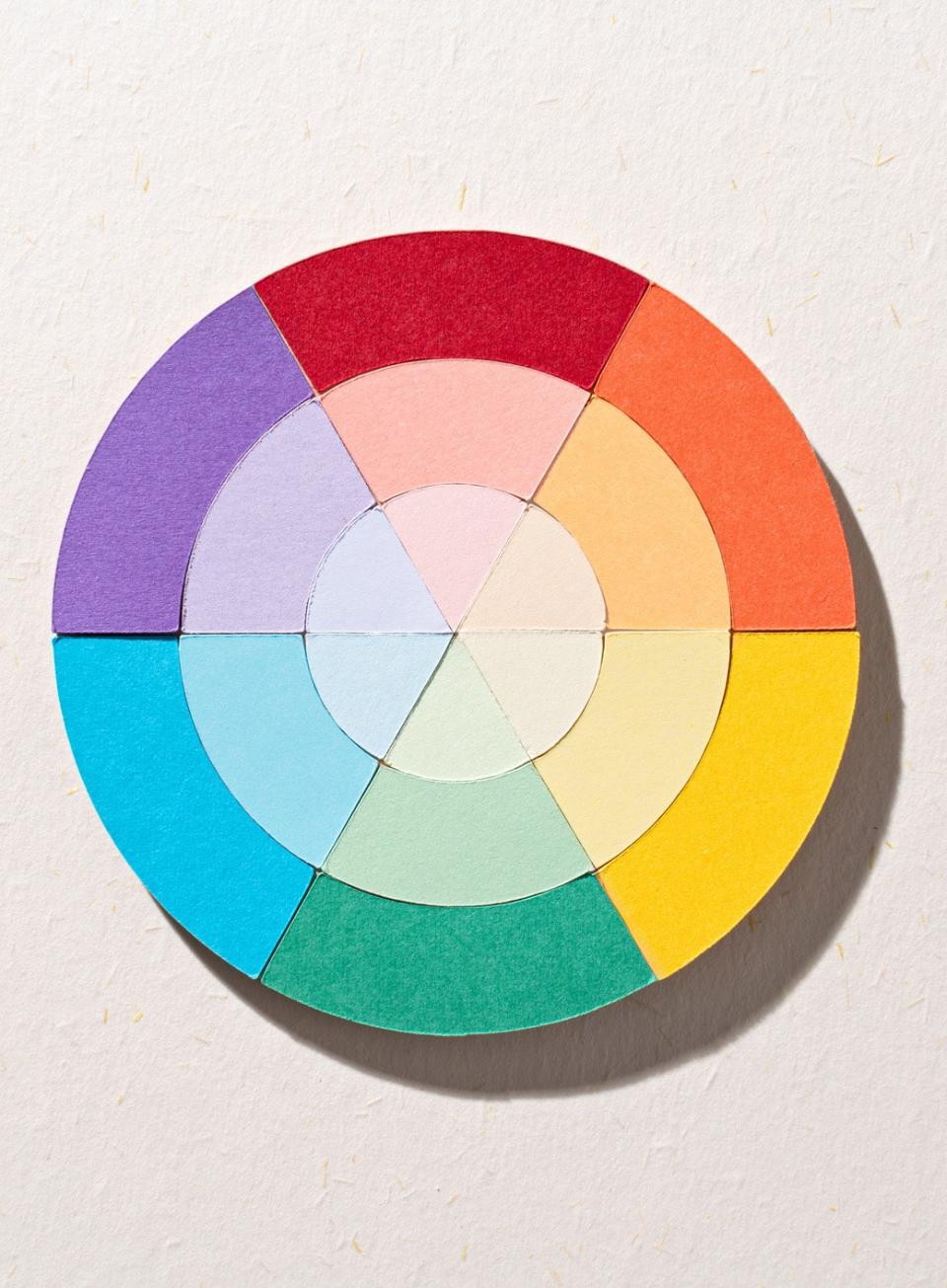
Newton’s color wheel soon evolved from the original colors he noted into one that was organized by primary, secondary, and tertiary colors. Primary colors are red, blue, and yellow, and are arranged in an equilateral triangle on the circular wheel. Primary colors are considered foundational, basic colors, meaning that they cannot be created from other colors; it also means that all other colors are created by using them.
Secondary colors are created by mixing two primary colors, in equal parts, to create a new color: green (blue + yellow), orange (yellow + red), and purple (red + blue). On the color wheel, they are organized in a triangular arrangement, equally spaced from its origin primary colors.
Tertiary colors are formed when a primary color is mixed with a secondary color that is located next to it on the color wheel, such as red mixing with orange to create red-orange (think of it as red mixed with just a bit of yellow). There are six tertiary colors because of the mixing of the three primary colors with three secondary colors, and they are located between primary and secondary colors on the color wheel. Tertiary colors are: red-orange, yellow-orange, yellow-green, blue-green, blue-violet, red-violet.
Some Color Wheel Lingo
It may seem obvious, but color is the general term we use to describe every hue, tint, tone or shade we see. White, black, and gray are often referred to as neutral colors.
On the other hand, the term hue refers to the dominant Color Family of the specific color we’re looking at. White, black, and gray are not considered hues. On color wheels, hues are the primary and secondary colors found at the outermost ring of the diagram.
Saturation, or chroma, refers to the level of intensity or brilliance of a color. At its most saturated, a pure hue will not have any white, gray, or black added to it, and will be at the outermost ring of the color wheel.
A tint, sometimes called a pastel, is created by adding white to a pure hue, creating a color that is lighter than the original hue. For example, adding pure white to red creates a pink color that is a lighter version of red. While it may appear that adding white affects the color’s brightness, it’s actually only changing its vibrancy, creating a paler version of the original base hue.
A shade is created when black is added to a pure hue or mixture of pure colors. A shade will typically be a darker version of a hue that can usually intensify the color—think of a pure red going from a bright, bold statement to a deeper, moodier color with the addition of a bit of black.
A true tone is a hue (or mixture of pure colors) that has had a neutral gray added (a neutral gray is comprised of equal parts black and white). Tonal colors are typically seen as sophisticated and complex because of the way they remove some of the vibrancy and brightness of hues. They’re generally perceived as pleasing to the eye, perhaps because almost every color that we encounter on a daily basis has been toned to some degree (think about how unusual it is to find a true, fiery red in nature).
Color Harmonies
Color harmony is a color theory technique that involves using color in a way that creates a visually appealing, harmonious combination. Color harmony has a long history, but was more deeply explored during the Renaissance and Scientific Revolution, as art, pigments, and painting techniques evolved. Generally speaking, there are five types of color harmony that can be used to help figure out what colors go together: complementary, analogous, monochromatic, triadic, and tetradic colors.
Complementary colors are color combinations that are opposite each other on the color wheel, such as blue and orange, red and green, or yellow and purple. Secondary and tertiary colors can also be complementary, like blue-greens and red-purples. Because they’re so far away from each other on the color wheel and share no common hues, when they’re paired together, complementary colors create strong contrasts and can energize a room. Miami-based interior design firm and AD PRO Directory member AGSIA, for example, used the vibrant color combination of yellow and blue in the bedroom of a waterfront apartment, creating what they describe as a space with “a bold flair” that “gives off major personality.”

A version of complementary colors are split-complementary colors, in which the color scheme is created by combining a base color with colors that are adjacent to the base’s complement color. For example, blue’s complement is orange, so its split complementary colors are red-orange and yellow-orange. The advantage of using split-complementary colors is that the combination still has tension and vibrancy because the colors are so far away from each other on the color wheel, but they are slightly more unexpected and create more visual interest and variety than the typical complementary color. As Virginia-based interior designer and AD PRO Directory member Darlene Molnar notes, “Split complementary is a great way to add more color while remaining complementary.”
Analogous colors are those that are located next to each other on the color wheel, and are considered to be the simplest and most stable type of color harmony because of their close proximity. Examples of analogous colors are red and red-orange, or blue and blue-green. When artists, designers, and others are developing their color schemes, they’ll often use a combination of complementary and analogous color harmonies to create visual interest that has depth, complexity, contrast, and chromatic stability. Rudy Saunders, design director at Dorothy Draper & Co., for example, says that when they’re designing for a more subdued space, they seek color palettes that fall within a single color family or an analogous scheme. “Just like when you look out at a body of water, the many shades of blue of the water blend beautifully together,” he explains.

Monochromatic colors are color schemes based on variations of a single color. Using the same hue on the color wheel, monochromatic colors will typically vary in tone (addition of gray), shade (addition of black), or tint (addition of white). Monochromatic color combinations can appear unifying and often refined, with subtle differences like texture and shine to help further play with the use of a single hue.
Triadic colors is a color harmony involving three colors that are equidistant from one another on the color wheel, creating an equilateral triangle. Because of their distance from each other on the wheel, each color does not share any common color hues, and the result is often a balanced but vivid contrast. One of the most common triadic color harmonies are the primary colors (red, yellow, and blue), but secondary colors (orange, green, and purple) are less easily noticeable but still common combinations.
Tetradic colors, also known as double complementary colors, are color combinations that use two pairs of complementary colors for a total of four (“tetra,” in Greek) colors. When looking at the color wheel, the four could create a square or a rectangle, depending on whether the four colors are equally distanced on the color wheel or not. An example of a tetradic scheme where the colors are equally spaced apart would be red, green, yellow-orange, and blue-purple. Because of the two sets of complementary colors, tetradic schemes are typically powerful, dynamic, and dramatic, especially when they use pure hues rather than tints or tones.
Warm and Cool Colors
Generally speaking, primary colors are seen as most vibrant and eye-catching, and colors become less vivid and more subdued with each mixing. But regardless of vibrancy, most colors are either warm-toned, cool-toned, or neutral.
Hues that have a strong red or yellow base tend to be considered warm colors, such as yellows, browns, tans, pinks; warm colors are often associated with daylight, sunset, and more broadly fire and heat. Designer and AD PRO Directory member Sarah Jeffreys, of Sarah Jefferys Architecture + Interiors, explains that she finds these warm colors to be “cheerful, bright, playful, and happy hues that can evoke a sense of cheery sociability and optimism. I use these bright warm hues anywhere I can, but I am especially known to love a splash of color in the kitchen with the lighting or backsplash to bring vitality to the heart of the home.”
Cool colors, on the other hand, typically have a blue base and can range from greens to blues to purples, and are often associated with feelings of serenity and calmness—perhaps because of the connection to water or the sky. As interior designer and principal at Laure Nell Interiors, an AD PRO Directory firm, Laetitia Laurent suggests, “Cooler hues like deep emerald greens or misty slate blues can make a room feel both expansive and serene, perfect for creating a sense of calm in a bedroom or study.” But regardless of whether you use warm or cool colors—or both mixed together—she emphasizes that “it’s about using color intentionally to influence both how a space looks and how it feels.”

Who Uses A Color Wheel?
Color wheels help just about anyone doing anything visual. Artists, designers, craftspeople, marketers, and many others use color wheels and color theory to help to decide what colors go together, and what statement they want to make. For interior designers, decorators, and architects, color wheels and color theory are fundamentally important to their work because it helps evoke emotions, create visual harmony, and reinforce brand identity, while also guiding focus and improving legibility.
Melissa Oholendt, founder and design principal of Oho Interiors explains, “While designers don’t always play by the traditional rules of color theory (we are meant to push boundaries), what we find is that a deep knowledge of color theory allows us to pick colors that work well together in projects and convey an overall feeling, room-by-room, in ways that are curated to our client’s needs in their home and life.” Ultimately, leveraging the use of a color wheel can ensure that designs are aesthetically pleasing, culturally appropriate, and functional while enhancing a client or user’s experience.
What are the primary, secondary, and tertiary colors on a color wheel?
Primary colors are red, blue, and yellow. Secondary colors are orange, green, and purple, while tertiary colors are combinations of adjacent primary and secondary colors: red-orange, red-purple, blue-purple, blue-green, yellow-green, and yellow-orange.
How do complementary colors work, and how can they be used in design?
Complementary colors are colors that are found at opposite ends of the color wheel and do not have any common base hues. Because of the strong contrast and tension between the colors, they’re most often used to create bold, vibrant color statements.
What is the difference between warm and cool colors on the color wheel?
Warm colors on the color wheel typically are on the side of the wheel with reds, oranges, and yellows; cool colors are usually on the opposite side, with blues, greens, and violets.
How can the color wheel help in creating color harmony in art and design?
Color wheels assist in creating color palettes that achieve a desired mood, feeling, or meaning. Color wheels are a visual means of understanding the relationships among colors—how they are created, how they relate to one another, and what might work well together for certain situations. With the use of complementary, monochromatic, analogous, triadic, or even tetradic color combinations, color palettes can be vibrant, complementary, contrasting, unifying, calming, deep, and complex.
Originally Appeared on Architectural Digest
More Great Stories From AD It Yourself
Sign up for our daily newsletter to get the best of design in your inbox
13 Blue Kitchen Ideas to Steal, From the Boldest Pops of Color to Clever Tilework
7 Design Ideas We’re Borrowing From Sarah Sherman Samuel’s Whimsical Remodel
3 DIY-Friendly Home Transformations That Yield Wildly Dramatic Results
IKEA Preowned: Everything You Need to Know About the Furniture Company’s New Secondhand Website
Not a subscriber? Join AD for print and digital access now

